

Why Does Every Finance Office Feel Like a Set from American Psycho?
In big finance, the office is a stage. It projects competence, scale, and control—the image clients expect from the people steering their money and, frankly, their future. Budgets, allocations, risk models—precision is the job. But does the look of that precision have to be ice-cold?
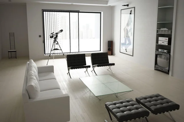
We all know the default: white walls, glass partitions, chrome edges, minimalist furniture. It’s the aesthetic equivalent of a quarterly report—clean and legible, sure, but almost aggressively emotionless. It promises austerity and “no surprises,” which is comforting on paper. In practice, symmetry and sameness flatten everything. Rows of identical desks, monochrome palettes, vast negative space—spaces that read as controlled but land as underwhelming, even a little soulless. Glass can be great in the right dose—daylight, sightlines, transparency. In overdose, it becomes a fishbowl: one vast “open” room where focus, acoustics, and privacy go to die.
Start with a softer material vocabulary and a more human rhythm. Precision doesn’t require sterility. You can broadcast reliability and sophistication without recreating a surgical suite.:
Material mix: pair woods with stone or metal to signal craft and permanence. Matte beats mirror; texture beats glare.
Warmth and greenery: real plants and natural finishes cut the corporate chill and boost comfort and focus.
Color as strategy: muted earths, deep blues, and confident accents define zones and support wayfinding without yelling.
Form language: blend organic curves with disciplined lines; the contrast communicates empathy and rigor.
Furniture should invite, not intimidate. Retire the “don’t get comfortable” lobby chair and upgrade to pieces that say, “We’re present, not posturing.”
Right-sized desks and chairs: ergonomics as policy, not perk.
Configurable collaboration: mobile whiteboards, soft-seating islands, tables sized for real work.
Acoustics baked in: upholstery, ceiling baffles, and absorbent partitions; quiet is a productivity feature, not an accident.
Control comes from adjacency and flow, not from wiping the plan clean.
Clear neighborhoods: focus, collaboration, client, and recharge zones so people aren’t fighting the space to do the work.
Client paths: a composed arrival sequence with confident, not cold, materials—hospitality cues without the hotel cliché.
Tool proximity: put print, sample, storage, and tech where the work actually happens. Fewer laps, more progress.
What you signal—without saying a word—matters. A thoughtful finance office tells a story: disciplined and human; analytical and approachable. When culture, space, and people are in balance, performance follows. The environment stops acting like a museum for money and starts acting like an engine for it.
The quick playbook:
Lose: all-glass everything, endless white, copy-paste desks, lobby chairs built to repel humans.
Keep: clarity, legibility, durable finishes, elegant details that reward a second look.
Add: warm materials, controlled color, layered lighting (ambient + task + accent), acoustic treatment, real plants, varied seating, and purpose-built zones.
Yes, billions are on the line. All the more reason your architecture shouldn’t pay the ultimate price. Treat the office with the same rigor you give a portfolio: diversify the mix, manage risk (acoustics, glare, traffic), and invest in assets that appreciate—culture, focus, trust. Keep the edge. Ditch the chill. Break the glass box (metaphorically), and build a space that makes people better at their jobs the moment they walk in.
Because the only thing your office should have in common with American Psycho is the confidence—minus the cold stare.